Note
Go to the end to download the full example code.
Creating publication-ready figures
While the ad-hoc settings of skultrafast are generally fine, some additional adjustment may be necessary to create figures for an article. Here, in this tutorial will the most common steps. If you think anything is missing or wrong, don’t hesitate to submit an issue or pull-request. If you looking for way to do something, please also have a look at the matplotlib documentation. It contains many examples and multiple tutorials.
*tl;dr
Call plot_helpers.enable_style() before creating your figures.
Checklist
Figure size set according to journal guidelines
Font
Selected according to journal guidelines
(optionally) mathfont selected accordingly to the main font
Distinguishable colors
Vector format used
Set rasterized
Truefor large images and colormaps in the figureNo part of the figure is clipped
Consistent energy axes
File creating the figure is under version control
Throughout the document we work with some example data
import matplotlib.pyplot as plt
from skultrafast import data_io, dataset
wl, t, d = data_io.load_example()
ds = dataset.TimeResSpec(wl, t, d)
ds.auto_plot = False
cds = ds.estimate_dispersion("gauss_diff").correct_ds
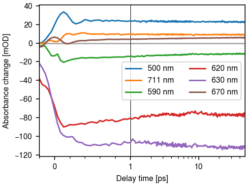
wls = (500, 5550, 590, 620, 630, 670)
/home/docs/checkouts/readthedocs.org/user_builds/skultrafast/envs/stable/lib/python3.11/site-packages/skultrafast/data_io.py:75: UserWarning: Reading `.npy` or `.npz` file required additional header parsing as it was created on Python 2. Save the file again to speed up loading and avoid this warning.
  wl, data, t = a["wl"], a["data"], a["t"]
Figure size
_Use the journal supplied figure size_
The most important step is to get the figure size correct. By default, matplotlib creates a 4 in by 3 in figure (1 in = 2.54 cm) which is a reasonable size for the screen but unsuitably large on paper. If the figure is just manually scaled down after creation, the font-size is too small and other small details like ticks may be not recognizable anymore.
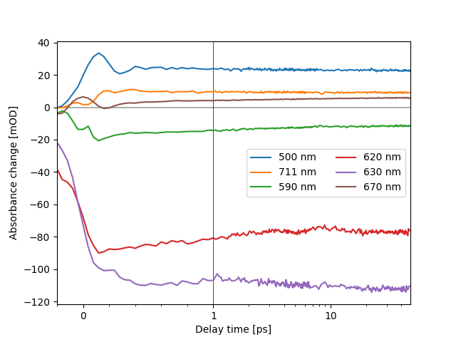
fig, ax = plt.subplots()
cds.plot.trans(*wls,  ax=ax)
[<matplotlib.lines.Line2D object at 0x757d43cd7ad0>, <matplotlib.lines.Line2D object at 0x757d43cca590>, <matplotlib.lines.Line2D object at 0x757d43cca8d0>, <matplotlib.lines.Line2D object at 0x757d43c08790>, <matplotlib.lines.Line2D object at 0x757d43be00d0>, <matplotlib.lines.Line2D object at 0x757d43c7d850>]
Instead, most journals author guidelines give values for the maximum width of figures, use them. It is not always necessary to use the full width, sometimes its okay to leave some free space. As a rule of thump, a single column figure should have width of around 3.5 in, a two column figure about 7.5”.
fig, ax = plt.subplots(figsize=(3.5, 3.5*(3/4))) # Figure with the same 4:3 ratio
cds.plot.trans(*wls,  ax=ax)
[<matplotlib.lines.Line2D object at 0x757d43c049d0>, <matplotlib.lines.Line2D object at 0x757d43bfbb10>, <matplotlib.lines.Line2D object at 0x757d43bf9150>, <matplotlib.lines.Line2D object at 0x757d43bb6e90>, <matplotlib.lines.Line2D object at 0x757d43bb5cd0>, <matplotlib.lines.Line2D object at 0x757d43bb7650>]
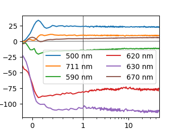
If the figure is too small on screen, which is often the case in the Jupyter-notebook, resist the urge to make the figure larger. Instead, increase the dpi of the figure. The matplotlib defaults of 100 dpi are quite low compared to modern screens. Desktop-screens often have around 144 dpi and laptop screens can get up 230 dpi.
fig, ax = plt.subplots(figsize=(3.5, 3.5*(3/4)), dpi=144) # Figure with the same 4:3 ratio
cds.plot.trans(*wls, ax=ax)
[<matplotlib.lines.Line2D object at 0x757d3f9b0250>, <matplotlib.lines.Line2D object at 0x757d3f9e5950>, <matplotlib.lines.Line2D object at 0x757d3f9f1b50>, <matplotlib.lines.Line2D object at 0x757d3f9f2650>, <matplotlib.lines.Line2D object at 0x757d3f9f3110>, <matplotlib.lines.Line2D object at 0x757d3f9f3d50>]
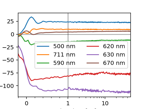
Still the figure looks a little bit toy-like. This is partly caused by the default font-size of matplotlib, which is to large for most publications. Before we continue, we save the changes we did so far as a default and also change the default font size. Most journals have guidelines for the font size in figures, apply them by directly adjusting the rcParams. For additional fine adjustment try to use relative font sizes. The suggested font-sizes for figures are generally between 7 and 9. We also use the constrainted layout for a better figure layout.
plt.rcParams['figure.figsize'] = (3.5, 3.5*(3/4))
plt.rcParams['figure.dpi'] = 144
plt.rcParams['figure.constrained_layout.use'] = True
plt.rcParams['font.size'] = 8

fig, ax = plt.subplots() # Figure uses rcParams as  defaults
cds.plot.trans(*wls, ax=ax)
[<matplotlib.lines.Line2D object at 0x757d3f8a8250>, <matplotlib.lines.Line2D object at 0x757d3f8c7790>, <matplotlib.lines.Line2D object at 0x757d3f8d0190>, <matplotlib.lines.Line2D object at 0x757d3f8d0cd0>, <matplotlib.lines.Line2D object at 0x757d3f8d1890>, <matplotlib.lines.Line2D object at 0x757d3f8d21d0>]
Font selection
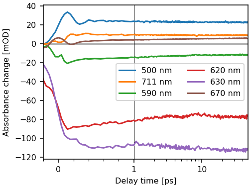
Select a font identical or similar to the font of the publication. When in doubt, choose Arial or Helvetica. The default font of matplotlib is DejaVu Sans. Its advantage it is free license and its great coverage of Unicode glyphs. But it looks quite unique and hence conflicts with the rest of document. Therefore I strongly advocate to change the font. Most journals have their own preference. If the journal does not propose a font, I suggest to use Arial, Helvetica or TeX Gyre Heros. While this may look boring, it also looks professional.
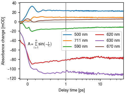
plt.rcParams['font.family'] = ["Arial", "Helvetica", "TeX Gyre Heros"]
fig, ax = plt.subplots() # Figure uses rcParams as  defaults
cds.plot.trans(*wls, ax=ax)
[<matplotlib.lines.Line2D object at 0x757d3f788250>, <matplotlib.lines.Line2D object at 0x757d3f7a9890>, <matplotlib.lines.Line2D object at 0x757d3f7a9fd0>, <matplotlib.lines.Line2D object at 0x757d3f7aa910>, <matplotlib.lines.Line2D object at 0x757d3f7ab250>, <matplotlib.lines.Line2D object at 0x757d3f7abad0>]
If the figure contains mathematical expressions, chaning the mathext font is also required for an uniform look.
plt.rcParams['mathtext.fontset'] = "stixsans"
plt.rcParams['mathtext.default'] = 'regular'
fig, ax = plt.subplots() # Figure uses rcParams as  defaults
cds.plot.trans(*wls, ax=ax)

ax.text(0, -50, r"$A = \sum_{i=1}^n sin\left(-\frac{t}{\tau_i}\right)$")
Text(0, -50, '$A = \\sum_{i=1}^n sin\\left(-\\frac{t}{\\tau_i}\\right)$')
Figure composition
Try to create composite figures by code.
Most figures in journals are multi-panel figures. There are a two ways to create such figures: either we create the single figures first and do the composition of the figures with a vector graphics program like Inkscape or we create the the multi-panal graphic directly in matplotlib. So which one should be used?
Using a vector graphics program has several advantages: wysiwyg, easy fine-tuning and mouse support. But this bought with some serve drawbacks: if you need change on of the sub-figures, you need to adjust the rest of the figure as well. Also, if you have to change fonts due to a resubmission, you have to apply it to both, the single figures and later added graphical elements. Also, version control not commonly supported for graphics format and exactly recreating a figure requires a lot manual steps.
Hence, if possible, do the whole figure in matplotlib. Initially, this can result if a lot manual adjustment for things like text labels. This can be often circumvented by using the text alignment settings and changing the transformation.
So how to built a more complex layout ? Matplotlib offers multiple ways to
layout figures. The most flexible way is use a gridspec. For
simple cases, the plt.sublots function. It supports the sharing of an axis
and also takes Avoid the plt.subplot function.
Colors
Make your colors distinguishable.
The choice of colors is matter of preferences, hence different people like different color-cycles. In general, the default matplotlib color-cycle works quite well. Still many people prefer other colors, e.g. the matlab color cycle, or you want to go for a more unique look. As long as you choose easily distinguishable colors, your are fine. Remember that figures are quite often used in presentations, hence to avoid remaking figures don’t use bright colors on a white background. In general, the color should be chosen with contrast in mind.
The color cycle is set via the axes cycler. See the matplotlib documentation. Note that matploblib also supports xkcd ans CSS color names.
File Format
Use vector formats. Rasterize large artists.
Luckily, most publishers accept or require the figures in a vector format. Therefore save the figure as an svg oder pdf file. If you somehow must supply a pixel format, use png and make sure the dpi is set to at least 300.
In general, using a vector format also reduces the file size. If the plot contains complex colormaps or images, it is appropriate to rasterize the corresponding artists. That means that these are embedded as an pixel graphic within the vector figure, thus decreasing the file size and the rendering time enormously.
Total running time of the script: (0 minutes 1.635 seconds)