Note
Go to the end to download the full example code.
2D Spectroscopy
This example demonstrates skultrafasts current capabilties when it comes to working with 2D IR-spectra. First, we need a sample spectrum. For that, skultrafast can access example data which is hosted on figshare and will be downloaded if necessary. The data was measured with the quickcontrol-software from Phasetech. We start by importing the required functionality.
import numpy as np
import lmfit
import matplotlib.pyplot as plt


from skultrafast import plot_helpers
from skultrafast.quickcontrol import QC2DSpec

# This class is the main class for 2D-data, we will not instanciated it ourself,
# since it will be generated by the quickcontrol class. Hence the following line
# is not necessary. If you want to work with the class, you can import it like
# this:

from skultrafast.twoD_dataset import TwoDim
from skultrafast.data_io import get_twodim_dataset

# To instanciate the class, it takes the two frequency-axes, the waiting times
# and the actual data. The data is a 3D-array with the shape (t, pump, probe).
The following line returns a path to a folder containing the sample data. If necessary, it will try downloading the data from the internet.
p = get_twodim_dataset()
Lets look at the content of the folder. For measurements with quickcontrol, we
are looking for .info files which contain all necessary information.
infos = list(p.glob("*.info"))
infos
[PosixPath('/home/docs/.cache/skultrafast/MeSCN_2D_data.zip.unzip/20210601_MeSCN#320.info'), PosixPath('/home/docs/.cache/skultrafast/MeSCN_2D_data.zip.unzip/20210601_MeSCN#319.info')]
There are two .info-files the directory. The first, index 319, contains the
transient 1D-data and the second (320) the transient 2D-data. Here in this
tutorial, we will work with the 2D data. Therefore we select the second file
and open it by instancing an QC2DSpec-class. Given the info-file, the class
collects all necessary data from the folder. It is also responsible to turn
the saved data, which are still inferogramms, into 2D-spectra. This process
also includes some preprocessing. Below we we apply 2 times upsampling of pump
axis and use 10 pixel left and right to estimate and subtract an background
before taking the FFT. For apodization, we are use the default hamming window.
plot_helpers.enable_style()

data2d_info_path = list(p.glob("*#320.info"))[0]
qc_file = QC2DSpec(data2d_info_path, upsampling=4, probe_filter=1)
To create a dataset to work with form the raw data, we call the make_ds
method. The method returns a dict of TwoDim objects to work with, containing
parallel (para), perpendicular (perp) and isotropic (iso) datasets. We
select the isotropic dataset.
ds_all = qc_file.make_ds()
ds_all["para"].integrate_pump().plot.spec(15, add_legend=True)
ds_all["perp"].integrate_pump().plot.spec(15, add_legend=True)
ds_iso = ds_all["iso"]
ds_iso.background_correction((2100, 2200), deg=1)
ds_iso.pump_wn *= 2162.5 / 2159.35  # correct pump calibration
The TwoDim-objects are the core structure to work with. They contain both
frequency-axes, pump_freqs and probe_freqs, the waiting times t, and the
actual data spec2d.
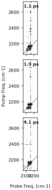
To start and to get an overview, we plot a contour-plot at 1 ps. Like for the
TimeResSpec-class, plotting functions are accessible under the plot
attribute. In general, the plotting functions return all artists which were
created. This is useful for further customization.
ds_iso.plot.contour(1, 2, 4)
{'fig': <Figure size 186.834x702 with 3 Axes>, 'axs': array([<Axes: >, <Axes: >, <Axes: >], dtype=object), 0: {'ax': <Axes: >, 'contourf': <matplotlib.contour.QuadContourSet object at 0x77f8a2b8db90>, 'contour': <matplotlib.contour.QuadContourSet object at 0x77f8a28ce610>, 'diag_line': <matplotlib.lines.AxLine object at 0x77f8a2835190>, 'title': Text(0.05, 0.95, '1.1 ps')}, 1: {'ax': <Axes: >, 'contourf': <matplotlib.contour.QuadContourSet object at 0x77f8a26af890>, 'contour': <matplotlib.contour.QuadContourSet object at 0x77f8a26ac750>, 'diag_line': <matplotlib.lines.AxLine object at 0x77f8a2d3fa10>, 'title': Text(0.05, 0.95, '1.9 ps')}, 2: {'ax': <Axes: >, 'contourf': <matplotlib.contour.QuadContourSet object at 0x77f8a2abb790>, 'contour': <matplotlib.contour.QuadContourSet object at 0x77f8a23553d0>, 'diag_line': <matplotlib.lines.AxLine object at 0x77f8a2df5c50>, 'title': Text(0.05, 0.95, '4.1 ps')}}
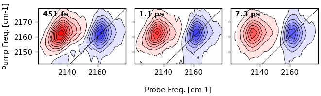
Selecting a subrange
Most of the 2D-map is empty. We are only interested in the region of the
signal, hence we have to select a sub-range. The methods return a new and
smaller TwoDim dataset. In general, most methods which would modify
the data return a new dataset. Now we also plot the contour at different
time-points, 0.5, 1 and 7 ps.
ds = ds_iso.select_range((2140, 2180), (2120, 2180))
artists = ds.plot.contour(0.5, 1, 7, direction="h")
There is also a .select_t_range method.
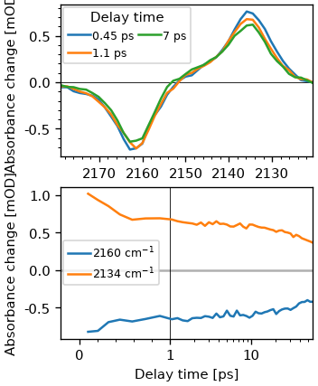
Extracting a transient 1D-spectrum
Using the projection theorem by integrating over the pump axis, we can
calculate a normal transient 1D-dataset. In skultrafast, this is archived by
the TwoDim.integrate_method, which returns a skultrafast TimeResSpec. Here
we integrate over the whole range. It is possible to integrate over a
sub-range by supplying arguments to the function.
ds1d = ds.integrate_pump()

fig, (ax0, ax1) = plt.subplots(2, figsize=(3, 4))
ds1d.plot.spec(0.5, 1, 7, add_legend=True, ax=ax0)
ds1d.plot.trans(2160, 2135, add_legend=True, ax=ax1)
[<matplotlib.lines.Line2D object at 0x77f8a2460bd0>, <matplotlib.lines.Line2D object at 0x77f8a2461190>]
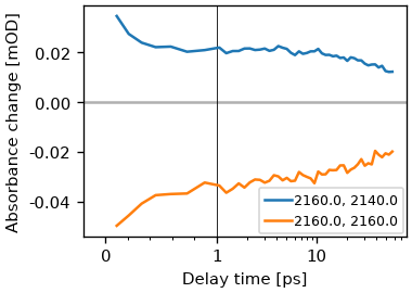
Plotting a single pixel
We can plot a the signal vs the waiting time using the trans method.
ds.plot.trans(pump_wn=2160, probe_wn=[2140, 2160])
plt.legend()

# For custom data analysis it is possible to select data along coordinates using
# the `TwoDim.data_at` method.
<matplotlib.legend.Legend object at 0x77f8a6f70950>
Extracting the anharmonicity
Two diminsional spectra are often used to extract the anharmonicity of a
vibrational mode. This is simply archived by calculating the distance between
the the positve and negative peaks in a 2D spectrum. For that we use the
TwoDim.minmax method, which returns a dict containg the coordinates of the
minima, maxima and the anharmonicity for a given wainting time.
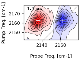
minmax = ds.get_minmax(0.5)
minmax
{'ProbeMin': np.float64(2161.6064158893373), 'ProbeMax': np.float64(2135.741285235902), 'PSAMax': np.float64(2162.597823049661), 'PumpMin': np.float64(2162.426266976608), 'PumpMax': np.float64(2162.3979482076584), 'Anh': np.float64(25.865130653435244)}
Simliary we can also mark the positions in a contour plot.
ds.plot.contour(1)
ds.plot.mark_minmax(1, color="white", markersize=9)
[<matplotlib.lines.Line2D object at 0x77f8a295f1d0>]
Center line slope analysis
One of the most common ways to analyze a two-dimensional dataset is to measure the frequency-frequency correlation function (FFCF). The most common ways for extraction is to determine the center line slope decay, which under certain assumptions is proportional to the FFCF.
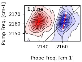
To extract the cls for a single time-point, we use the single_cls-method.
Let’s determine the cls for 1 ps. We use a window of 10 cm-1 in both pump and
probe axis around the maximum for determination. The algorithm currently uses
the center-of-mass.
single_cls = ds.single_cls(1, pr_range=10, pu_range=10)

# Plot the result
artists = ds.plot.contour(1)
ax = artists[0]["ax"]

# First plot the maxima
ax.plot(
    single_cls.max_pos, single_cls.pump_wn, color="w", marker="o", markersize=3, lw=0
)

# Plot the resulting fit. Since the slope is a function of the pump frequencies,
# we have to use y-values as x-coordinatetes for the slope.
ax.plot(single_cls.linear_fit, single_cls.pump_wn, color="r", lw=1)

[<matplotlib.lines.Line2D object at 0x77f8a2565b90>]
same arguments as single_cls, except the single waiting time. The
information of each single cls is accessible in the cls result. However, in
newer versions the easiest way to plot the resulting CLS lines is to supply an
instance of the ClsResult to the contour-method. Further styling of the
plot can be done by supplying the cls_plot_kws and cls_fit_plot_kws
arguments.
cls_result = ds.cls(pr_range=10, pu_range=10)

ti = ds.t_idx(1)
artists = ds.plot.contour(0.2, 5, cls_result=cls_result)
ax = artists[0]["ax"]
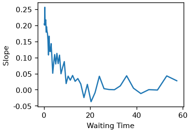
Lets look at the time-dependence of the slope.
fig, ax = plt.subplots()
ax.plot(cls_result.wt, cls_result.slopes)
ax.set(xlabel="Waiting Time", ylabel="Slope")
[Text(0.5, 41.00000000000001, 'Waiting Time'), Text(40.99999999999999, 0.5, 'Slope')]
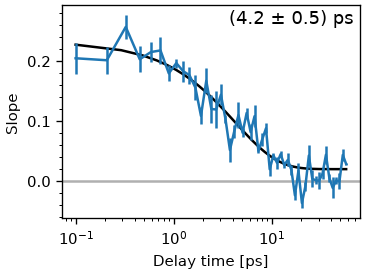
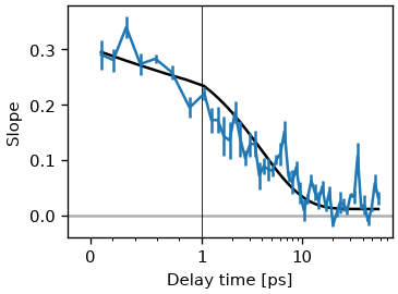
The ClsResult class also offers a convenience function to the fit cls with exponential functions.
tau_estimate = [5.0]
fr = cls_result.exp_fit(tau_estimate, use_const=True, use_weights=True)

fig, ax = plt.subplots()
cls_result.plot_cls(ax=ax)
text = "(%.1f ± %.1f) ps" % (fr.params["a_decay"].value, fr.params["a_decay"].stderr)
ax.annotate(
    text, (0.98, 0.98), xycoords="axes fraction", ha="right", va="top", fontsize="large"
)
ax.set_xscale("log")
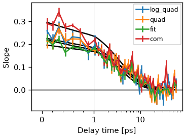
Notice that there a multiple methods to calculate the extrema position for each pump wavelengths. skultrafast currently supports center-of-mass, quadratic fit, quadratic fit of the log-vales and gaussian fit methods. In general, the results of all methods should not differ much. This is shown below.
fig, ax = plt.subplots()
methods = "log_quad", "quad", "fit", "com"
for m in methods:
    cls_result_fit = ds.cls(pr_range=12, pu_range=10, method=m)
    fr_fit = cls_result_fit.exp_fit(tau_estimate, use_const=True, use_weights=True)
    data_line, _ = cls_result_fit.plot_cls(ax=ax, symlog=True)
    data_line.set_label(m)

ax.legend()
<matplotlib.legend.Legend object at 0x77f8a2b09110>
is the slope the nodal points, which is the point where the spectrum crosses zero. The nodal line is calculated by fitting the region near the zero-crossing with a thrid degree polynomial and calculating the zero-crossing of the polynomial for each pump-slice.
fig, ax = plt.subplots()
cls_result_nodal = ds.cls(pr_range=5, pu_range=10, method="nodal")

fr_fit = cls_result_nodal.exp_fit(tau_estimate, use_const=True, use_weights=True)
data_line, _ = cls_result_fit.plot_cls(ax=ax, symlog=True)

# Contour to display the nodal line at 1 ps
artists = ds.plot.contour(1, cls_result=cls_result_nodal)

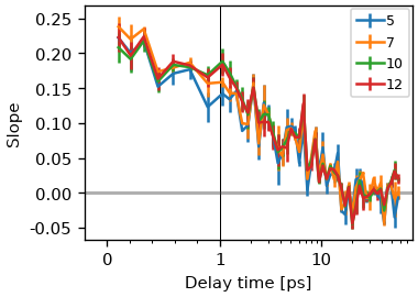
What is often more problematic is the sensitivity to the chosen region. It is often suggested taking only a small region around the peak, but this makes the determination of the slope more error-prone. In most settings, the resolution of the pump axis is rather limited, when using the correct factor of two for oversampling.
fig, ax = plt.subplots()
pump_range = (
    5,
    7,
    10,
    12,
)
for r in pump_range:
    cls_result_fit = ds.cls(pr_range=r, pu_range=r, method="fit")
    data_line, _ = cls_result_fit.plot_cls(ax=ax, symlog=True)
    data_line.set_label(r)

ax.legend()
<matplotlib.legend.Legend object at 0x77f8a2b5f5d0>
Gaussian Fit
Another method to determine the FFCF is to fit a 2D-gaussian to the 2D spectrum.
The correlation factor between pump and probe-axis is then also proportional to
the FFCF. The method is implemented in the fit_gauss-method.
fr = ds.fit_gauss()
The result is a GaussFitResult object, which contains the fitted spectra,
the fit parameters and the correlation factors. First we look at the fit
results.
fig, (ax0, ax1, ax2) = plt.subplots(
    1, 3, figsize=(7, 2.5), constrained_layout=True, subplot_kw=dict(aspect=1)
)
ax0.contourf(
    ds.probe_wn, ds.pump_wn, ds.spec2d[ds.t_idx(1), :, :].T, 20, cmap="seismic"
)
ds_fit = fr.fit_out
ax1.contourf(
    ds.probe_wn, ds.pump_wn, ds_fit.spec2d[ds.t_idx(1), :, :].T, 20, cmap="seismic"
)
ax2.contourf(
    ds.probe_wn,
    ds.pump_wn,
    ds_fit.spec2d[ds.t_idx(1), :, :].T - ds.spec2d[ds.t_idx(1), :, :].T,
    20,
    cmap="seismic",
)
ax0.set_title("Data at 1 ps")
ax1.set_title("Gaussian Fit")
ax2.set_title("Residual")
Text(0.5, 1.0, 'Residual')
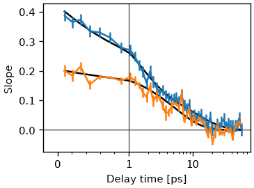
We can also plot the correlation factors.
res_gauss = fr.exp_fit([1, 5], use_const=False)
cls_result_fit = ds.cls(pr_range=6, pu_range=6, method="fit")
fr.plot_cls(symlog=True)
res_cls = cls_result_fit.exp_fit([1, 5], use_const=False)
cls_result_fit.plot_cls(symlog=True)
(<ErrorbarContainer object of 3 artists>, [<matplotlib.lines.Line2D object at 0x77f8a0ec61d0>])
Lets compare the time constants of the two methods. Gauss fit
res_gauss
Cls fit
res_cls
Amp ratios
r1 = res_gauss.params["a_decay"].value / res_gauss.params["b_decay"].value
r2 = res_cls.params["a_decay"].value / res_cls.params["b_decay"].value
Both ratios and and time-constants are in good agreement. The absolute amplitudes are not, but this is expected, since the gaussian fit ignores motional narrowing since it kind of ignores the lorentzian part of the lineshape.
print("Gauss: %.2f, Cls: %.2f" % (r1, r2))
Gauss: 0.14, Cls: 0.08
Diagonal
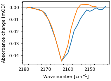
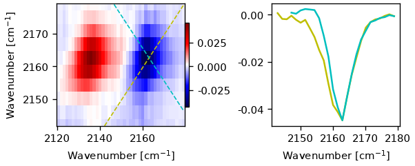
Another common usage of two-dimensional spectra is the extraction of the diagonal. The signal on diagonal is proportional to the fourth power of the transition dipole-moment, in contrast to the regular absorption (e.g. FTIR) spectrum, which is proportional to the second power. Hence, shoulders of peaks with different excitation coefficents are often more distinct in the diagonal. The diagonal can be extracted via the ‘diag_and_antidag’-method. The methods returns an object containing both the diagonal and anti-diagonal, additional it contains the y-coordinates of the lines. Latter can be useful for plotting. Again the method takes a waiting time to select the spectrum for extraction. Additionally, it takes parameters to shift the position of the diagonal used for extraction. If not given, it goes through the position of the minimum.
diag_result = ds.diag_and_antidiag(0.5)

fig, ax = plt.subplots()
ax.plot(ds.probe_wn, diag_result.diag)
ax.plot(ds.probe_wn, diag_result.antidiag)
plot_helpers.lbl_spec(ax)
The additional attributes of the result-object can be used to draw lines in the spectrum.
fig, ax = plt.subplot_mosaic("AABB", figsize=(5, 2), constrained_layout=True)

pm = ax["A"].pcolormesh(
    ds.probe_wn,
    ds.pump_wn,
    ds.spec2d[ds.t_idx(1), :, :].T,
    shading="auto",
    cmap="seismic",
)
ax["A"].plot(ds.probe_wn, diag_result.diag_coords, lw=1, c="y", ls="--")
ax["A"].plot(ds.probe_wn, diag_result.antidiag_coords, lw=1, c="c", ls="--")
ax["A"].set(ylim=(ds.pump_wn.min(), ds.pump_wn.max()), ylabel=plot_helpers.freq_label)
ax["A"].set_xlabel(plot_helpers.freq_label)
fig.colorbar(pm, ax=ax["A"], shrink=0.69, pad=0)

ax["B"].plot(ds.probe_wn, diag_result.diag, c="y")
ax["B"].plot(ds.probe_wn, diag_result.antidiag, c="c")
ax["B"].set_xlabel(plot_helpers.freq_label)
Text(0.5, 48.12500000000001, 'Wavenumber [cm$^{-1}$]')
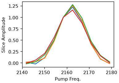
As an alternative, the pump-slice-amplitude method is also supported. Here we are calculating the difference between the maximum and minimum signal along the probe axis for each pump frequency. The resulting curve shares the same properties as the diagonal but is supposedly less influenced by excited state overlap (Valentine et al. doi:10.1021/acs.jpca.1c04558).
for t in [0.5, 1, 10, 30]:
    ds.plot.psa(t, normalize=2160)
Exponential Fitting
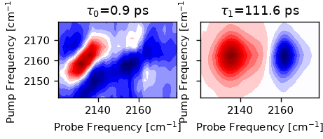
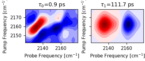
We can also fit a sum-of-exponentials to the spectrum, which results in a
2D-DAS spectrum. The fit_das method requires a initial guess for the decay
times. The method returns a object containing the results, including the
fitted spectrum and the fit parameters. We cut off waiting times below 0.4 ps
since the data is still affected by coherent artifacts.
exp_result = ds.select_t_range(0.4).fit_das([1, 20])
exp_result.minimizer
We can plot the 2D-component spectra.
n = len(exp_result.taus)
fig, ax = plt.subplots(1, n, sharex=True, sharey=True, figsize=(n * 2, 2.5))
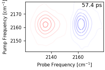
for i, tau in enumerate(exp_result.taus):
ax[i].set_title(rf"$\tau_{i}$={tau:.1f} ps")
ax[i].contourf(ds.probe_wn, ds.pump_wn, exp_result.das[i].T, 20, cmap="seismic")
ax[i].set_aspect(1)
ax[i].set_xlabel("Probe Frequency [cm$^{-1}$]")
ax[i].set_ylabel("Pump Frequency [cm$^{-1}$]")
Lets compare the fit to the data. We will we that the fit is rather good.
fig, ax = plt.subplots()
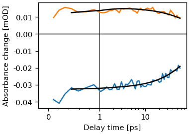
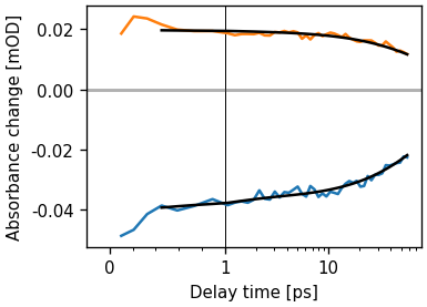
ds.plot.trans(2165, [2162, 2130], symlog=True, ax=ax)
exp_result.model.plot.trans(2165, [2162, 2130], symlog=True, ax=ax, c="k")
[<matplotlib.lines.Line2D object at 0x77f8a269a990>, <matplotlib.lines.Line2D object at 0x77f8a2566cd0>]
Exporting
To export a dataset to a textfile, use the ‘save_txt’ method. The method takes the path to an directory.
# ds.save_txt(PATH)
Make a movie
def movie_contour(self, fname, contour_kw={}, subplots_kw={}, ax_size=3):
    from matplotlib.animation import FuncAnimation

    ratio = np.ptp(self.ds.pump_wn) / np.ptp(self.ds.probe_wn)
    fig, ax = plt.subplots(
        subplot_kw=subplots_kw,
        figsize=(ax_size, ax_size * ratio),
        constrained_layout=True,
    )
    frames = self.ds.t

    ax.set_aspect(1)
    v = np.abs(self.ds.spec2d).max()
    levels = np.linspace(-v, v, 30)

    def func(x):
        ax.cla()

        ax.contour(
            self.ds.probe_wn,
            self.ds.pump_wn,
            self.ds.data_at(x).T,
            levels=levels,
            cmap="bwr",
            **contour_kw,
            algorithm="threaded",
        )
        ax.plot(
            cls_result.lines[ds.t_idx(x)][:, 1],
            cls_result.lines[ds.t_idx(x)][:, 0],
            c="w",
            lw=1,
        )
        ax.set(
            xlabel="Probe Frequency [cm$^{-1}$]", ylabel="Pump Frequency [cm$^{-1}$]"
        )
        ax.annotate(
            f"{x:.1f} ps",
            (0.98, 0.98),
            xycoords="axes fraction",
            ha="right",
            va="top",
            color="k",
            fontsize="large",
        )

    ani = FuncAnimation(fig=fig, func=func, frames=frames)
    ani.save(fname, dpi=300)


movie_contour(ds.plot, "test.webp")
MovieWriter ffmpeg unavailable; using Pillow instead.
Total running time of the script: (0 minutes 21.349 seconds)